ING is a globally active bank from the Netherlands. The identity is known for the orange color and the sitting lion. Both traditionally symbolizing the Netherlands.
ING’s strategy is built around empowerment and the promise to customers to make banking clear and easy, available anytime and anywhere and to keep getting better.
In my eyes, ING's current logo does not represent well what they aim to be known for. It looks traditional and fragile rather than bold, secure, and future-proof. Also in order to represent straightforward products and processes, you'd think that a more simple design approach would be desired.
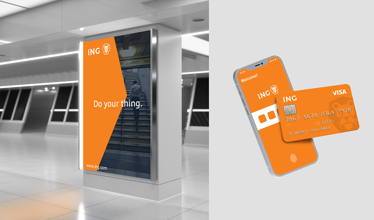
Most importantly, the current logo design lacks functionality and memorability. The lion looks messy from a distance and on a small scale. For the app icon, they solved this by zooming in on the face. It works but it also quite shows the lack of functionality and applying the logo in its current state won't get easier in the future.

I challenged myself to design a new version of ING's logo that would solve these problems and at the same time respects the essential recognizable features such as the colors, lockup and the presence of the bold and proud lion.
Going from the sitting lion to just the face is quite a radical change and it will take time for customers to adapt to the new logo but it will become a timeless and iconic mark over time that represents the bold, secure and empowering nature of the bank. The symbol had to be complimented with typography that is equally consistent and modern, yet captures the feel of a traditional, trustworthy bank.